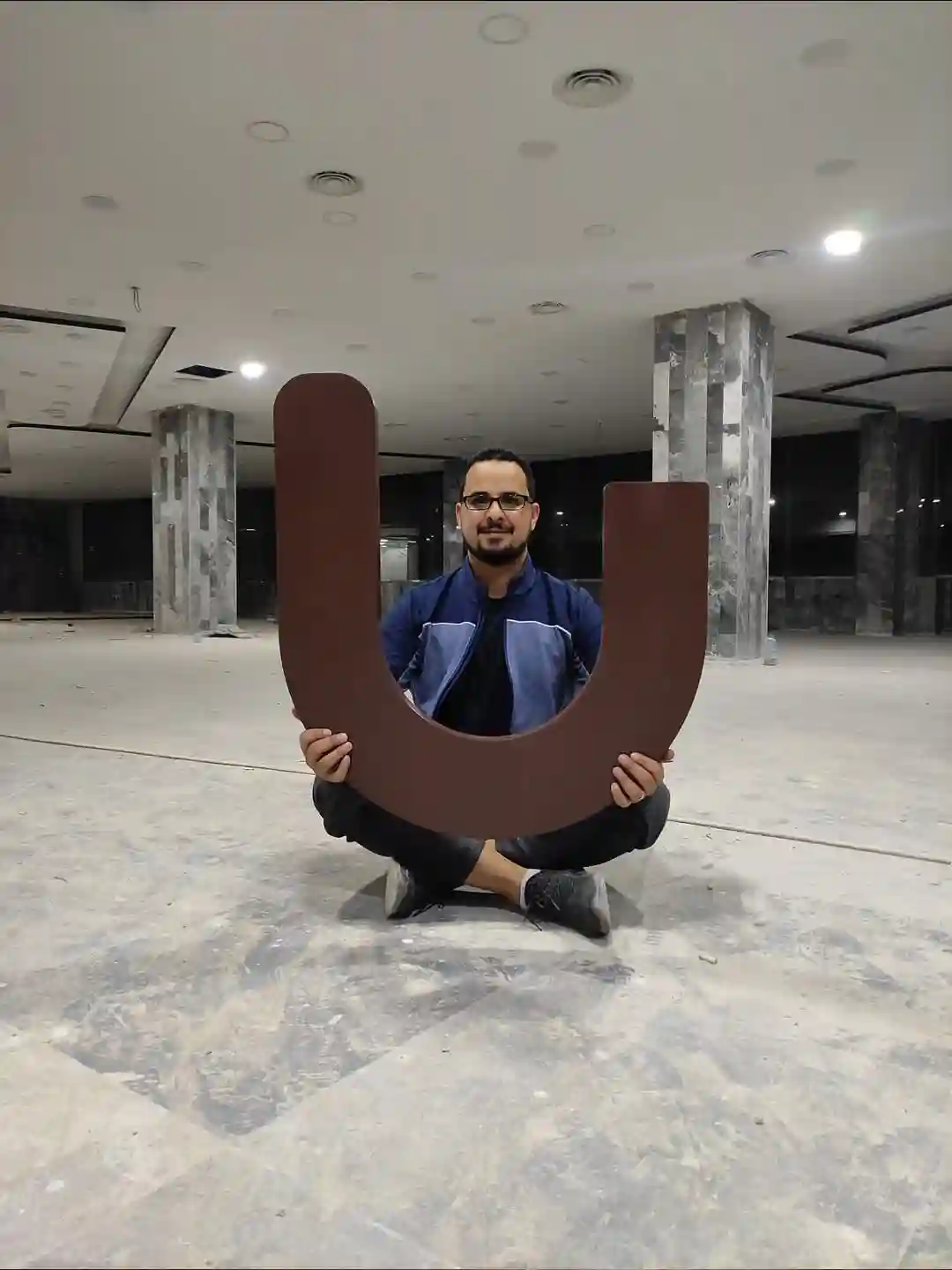
U-turn – Al-Shallal Mall Branch
We at U-turn restaurant thrive on having our customers go through one-of-a-kind experiences. So, we took a great care of our interior design.
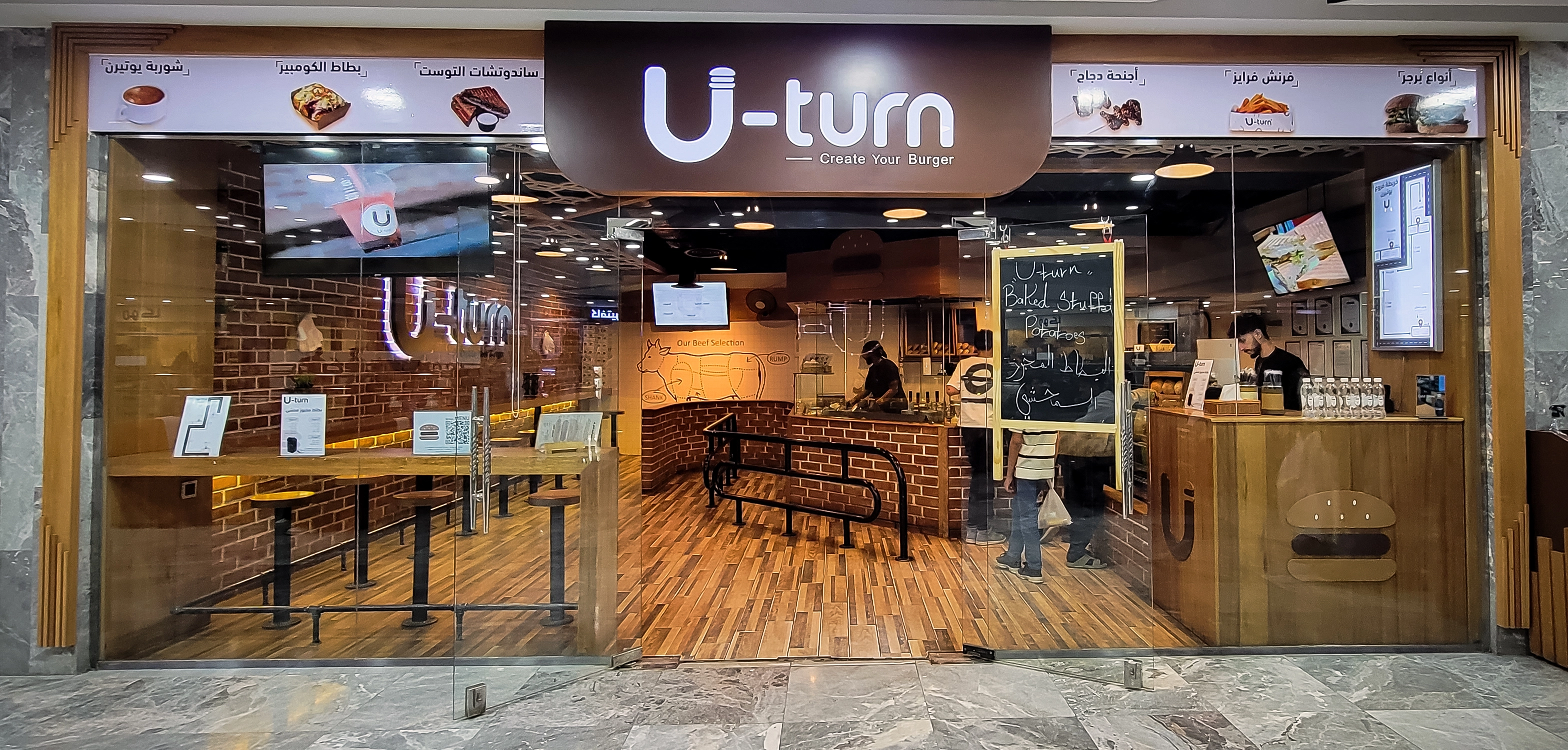
The interior design of the restaurant consists of big red bricks and wood (Mirandi) in its original color, In addition to premium Spanish tile. The kitchen and the cashier wall had been fully covered with light sugary calm color. So, it may give the customers and the employees the cleanness and natural lit up impression. Out of the kitchen parameter, one of the sugary tile walls, right in front of U-turn area we professionally drew an image of a caw to illustrate what areas of the cow we will extract our beef from based on the international standards that are used to make burger patties.
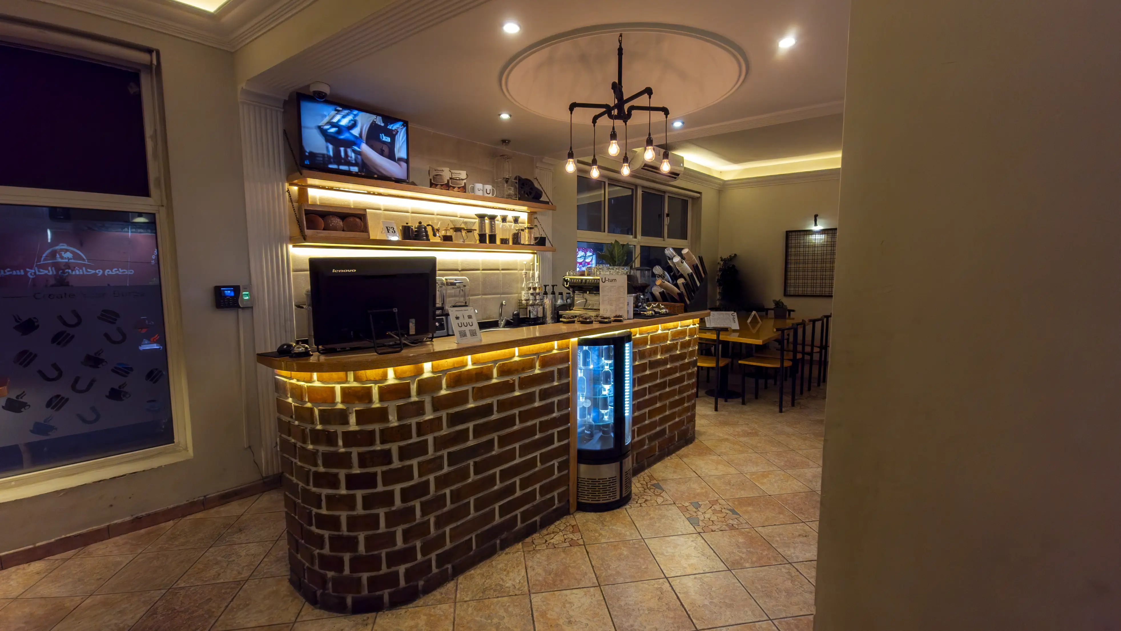
The wall facing the kitchen and the separators that belong to it, including the U-turn singe all built with large bricks on white cement which is a rare move because no one had used it in a restaurant before us in Yemen. The objective of using bricks is to give the customers a cozy feeling. Before U-turn, people were used to bricks only bakeries. On the brick wall that is facing the kitchen, we have designed and implanted an art piece that represent our subtitle made from the wood backed up with dimed lights that would enable our customers to take pictures of it and share it on social media.
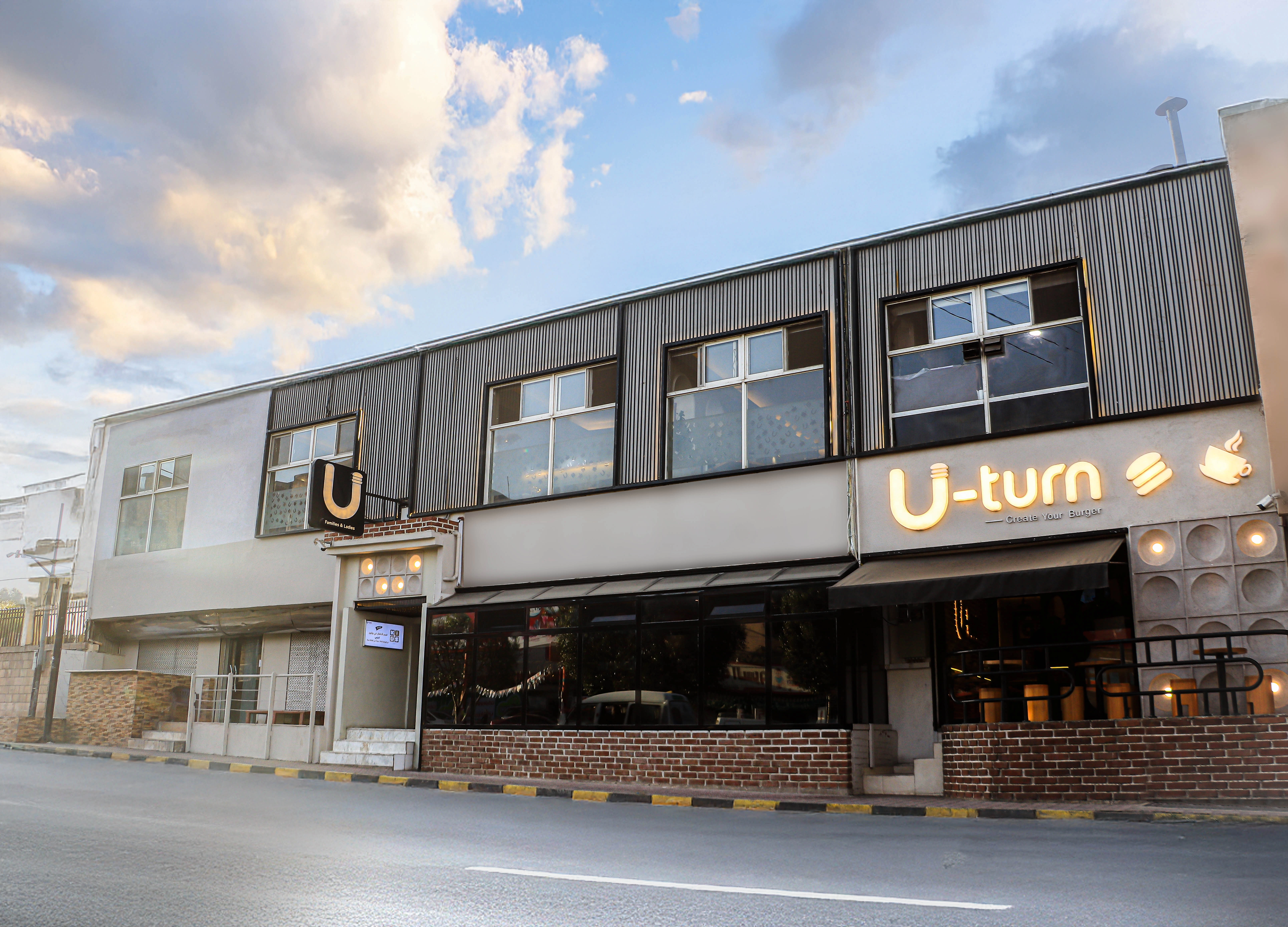
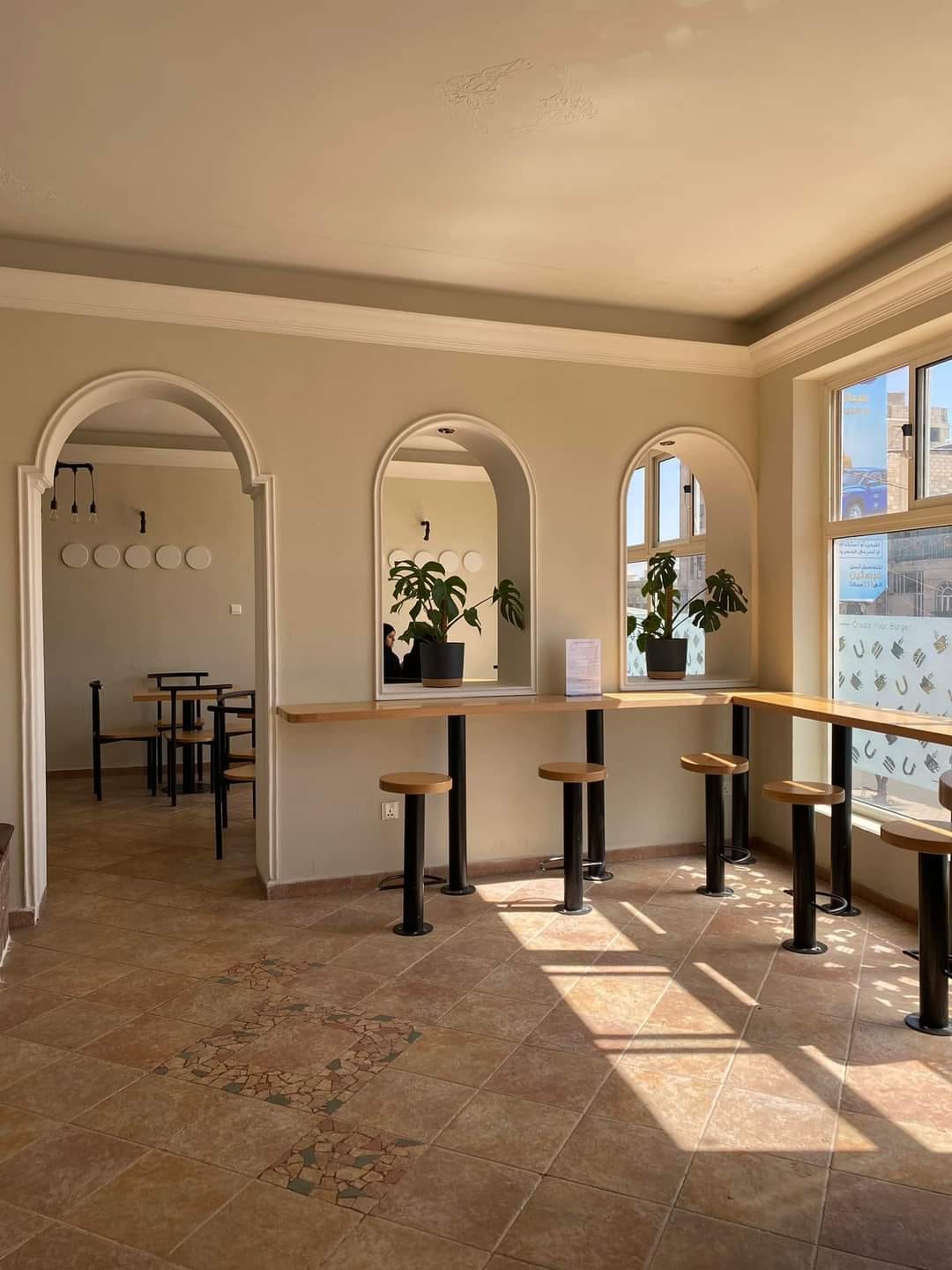
We choose the floor tile to be a wood color (Kalabarkih) so it may blend with the restaurant visual identity, which is the burned dark brown, light brown, sugary, black, and white. We painted the roof with a jet lack color and we left it open (see through – transparent) so it may show the air conditioning pipes, metal poles and electric wires and extensions; the idea is to give our customers the impression that they are walking into a modern production factory.
We used the (Mirandi) wood in its original color for making all kitchen counter tops, chairs, top and bottom edges of the restaurant and that includes the sampling area that is located at the front of the commercial center main entrance. We chose the (Mirandi) wood for its durability, strength, and beauty in its original color so it may not change its appearance over time. On the contrast, it will get more and more beautiful as time passes by.
We distributed three large size monitors in the most three important locations where there is an extensive customers movement. in the restaurant, and out of it, also near the cashier to display the advertisements regarding the meals and the documentary of the restaurant establishment.
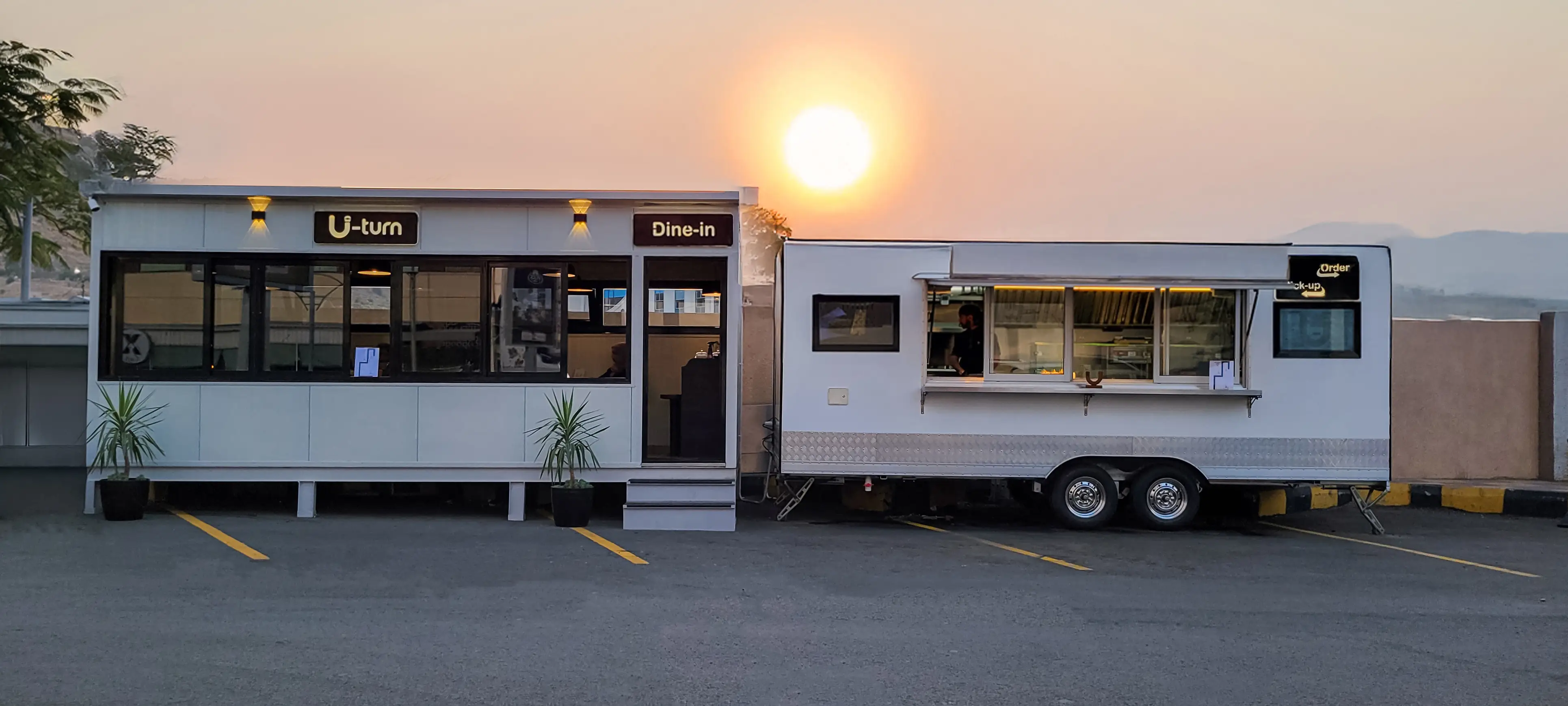
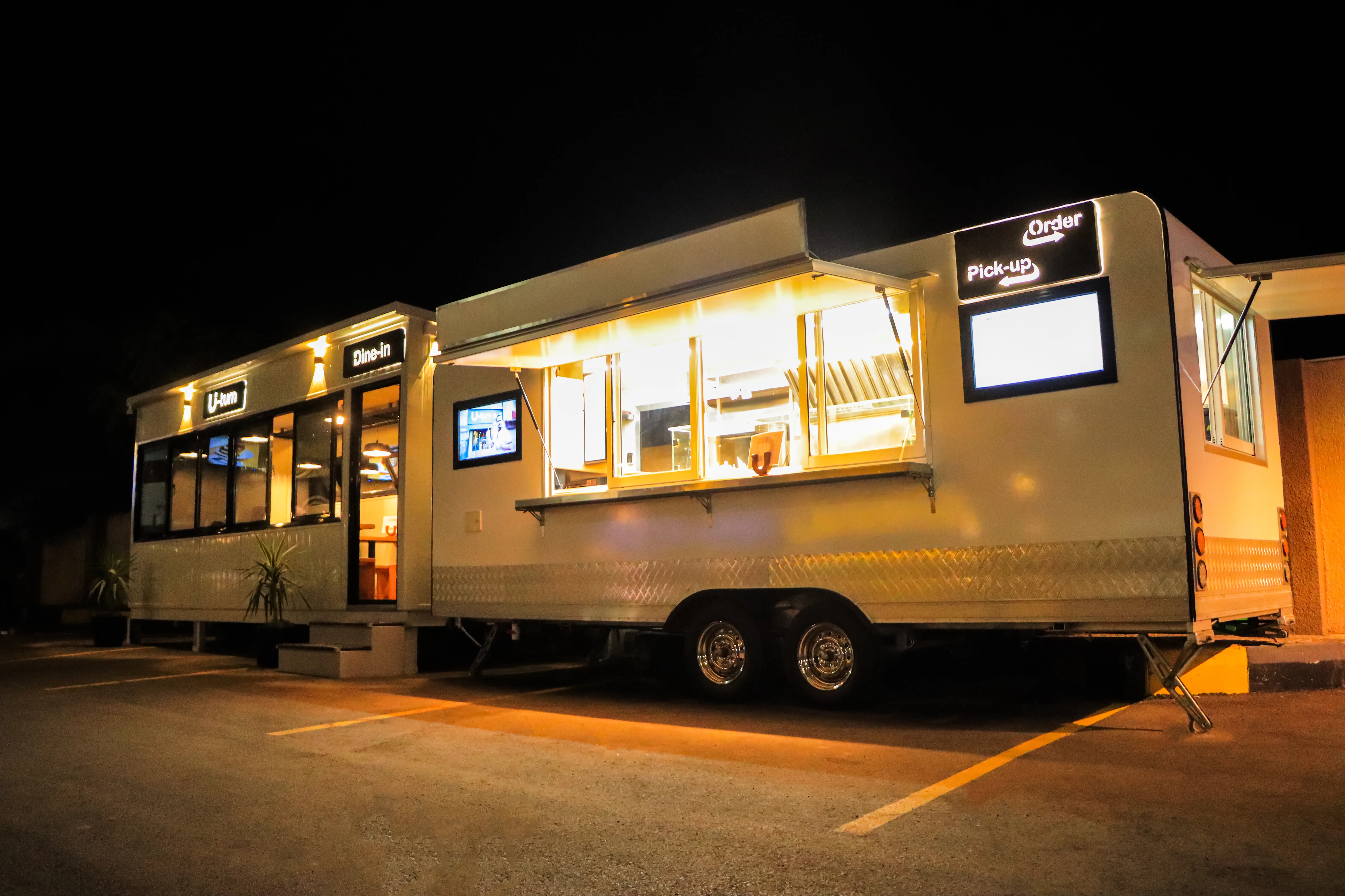
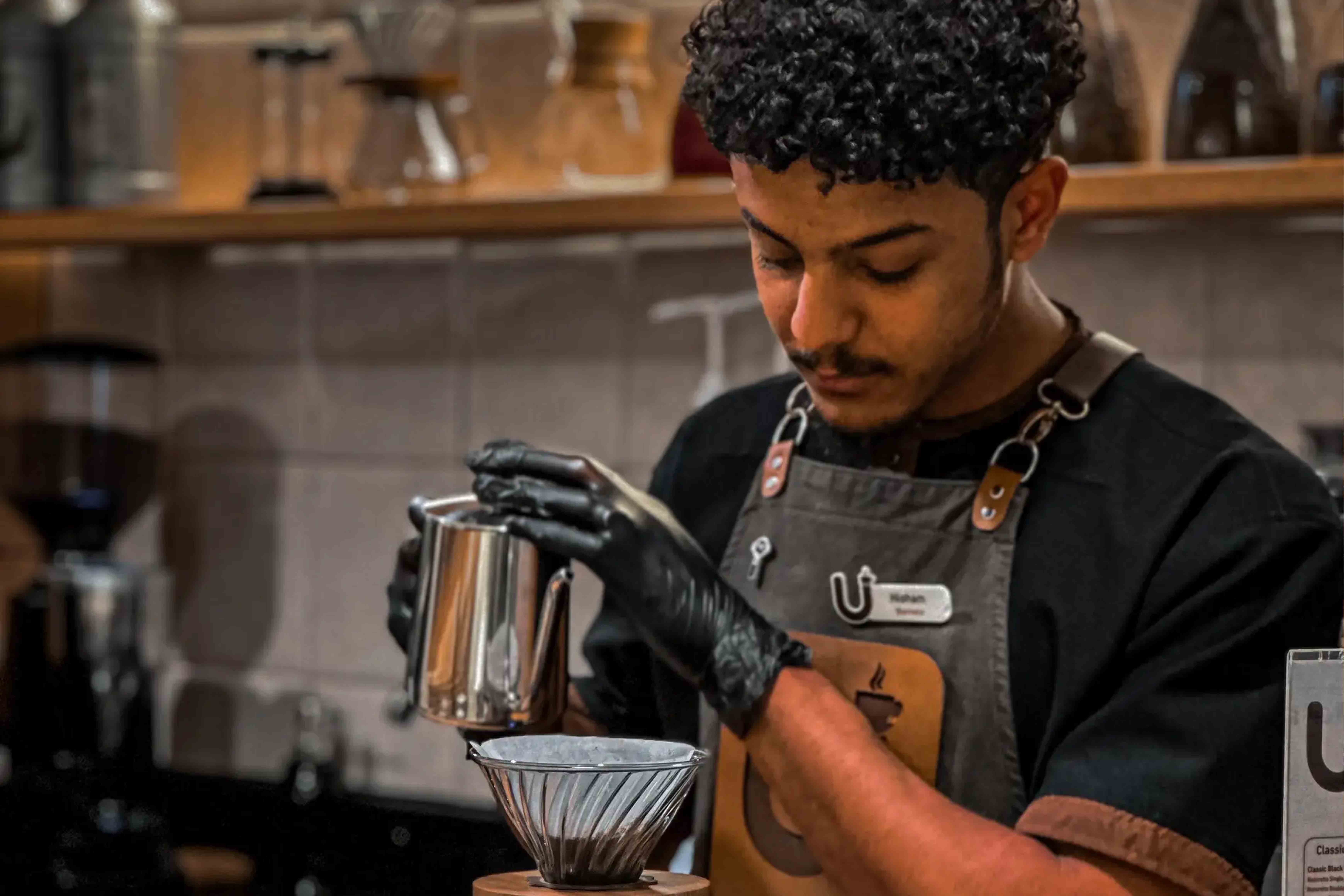
The outside sign built intentionally with simplicity with the original subtitle lights so the customer may not get confused and have them focused on the name of the restaurant and beautiful lights that would persuade them to come into the restaurant and explore more. We used in our restaurant the dimed yellow lights with a commercial style décor, so it may give the customers a relaxed and quite feeling. That will invite them in to enjoy our burgers in such atmosphere.


.webp)